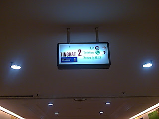
In addition, the signboard toilet quite hidden.
Problem statement:
- Customer difficult to find a toilet
- Customers need sharp eyesight to read the signboard. This situation would cause hardship to elderly people to read
- Not attractive and not look for size too small
- Font which is used is not very clear and painful eye.
- Small size and hidden signboard.
I provide solutions to make easier customers. This will also change the perception of customers who first came to the mega-mall to shop for providing the signboard that is easily understood and clearly legible.
Solution
- Provide a more luminous signboard for easy seen at night
- Customize the type, color and font size and background color suits the signboard so as not to hurt the eyes.
- Draw the symbols that are easy to understand with a simple explanation for easy all levels of understanding.
- Make signboard larger size for easy look
- Prepare a signboard which can move to look more attractive and increase the name Malayasia as a developed country
REFERENCE: INTERNET
POST BY: NURFADHILAH


No comments:
Post a Comment